Home »
One of the most well-known German automakers, Audi was founded in 1909 and joined Auto Union GmbH in 1932. With 13 production locations worldwide, the corporation, which is owned by Volkswagen AG, is currently present on every continent. It was determined in April 1933 that the Auto Union alone would be promoted in contests and racing events, rather than the different brands. Because of this and the ease with which people could recall it, the board of directors decided to adopt “Audi” as the single business name.
The Audi logo, with its four interlocking rings, represents the merger of four car manufacturers: Audi, DKW, Horch, and Wanderer. This merger in 1932 formed Auto Union AG, then the second-largest car company in Germany. Each ring symbolizes one of the founding companies, highlighting their unity and shared history. Horch stands for luxury, DKW for inventiveness, Audi for advancement, and Wanderer for exploration. Together, these elements form the logo, capturing Audi’s diverse identity and symbolizing quality, innovation, and luxury in the automotive industry.
We’ll discuss Audi’s inspiring history in this article, as well as the different turning points that led to the brand’s rise to fame.
Audi uses a distinctive Audi Type font when placing its wordmark on merchandise. The characters were created especially for the company. For many years the Audi font used in the past was a bespoke design incorporated into the brand identity. By using parallel letters, the original Audi logo made sense between the “A” and the “D” in the Audi logo. The wordmark’s symmetrical fonts disappeared as Audi simplified its design. Today’s sans-serif typography is quite subtle.
Audi logo and its history:
Massive accomplishments have marked Audi’s trek through the sands of time. From the introduction of its first little automobile, the Puppchen, to its rise to prominence as one of the biggest motorbike manufacturers of all time. This is an overview of Audi’s extended journey.
Before its initiation (1909):

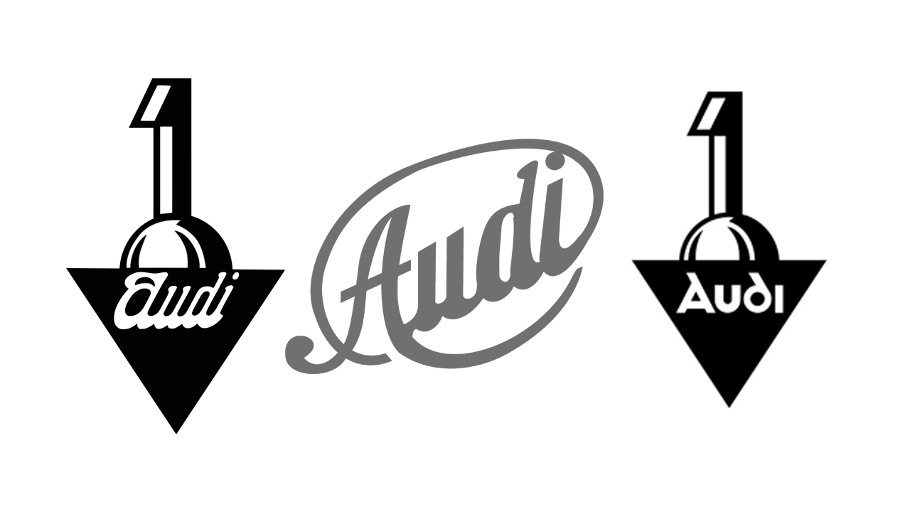
Audi used a short-lived logo before the official launch that featured custom cursive writing in a dark gray circle. It displayed a professional image but left no permanent mark.
In 1909:
A new logo appeared in the year of its official launch. This design featured the company name “Audi” in special typefaces, with a badge-like structure of a “1” sitting on top of a semi-circle, and a rotating triangle. The wordmark “Audi” was written on a narrow white line on a black background.
1909 – 1932:
An official logo was developed later that year, which consisted of a solid black rectangle facing downwards, with a secondary logo above it, and a white word created in bold smooth geometric lines on the upper edge of a shape.
1932 – 1949:
A big change took place during this time. The Great Depression forced four German car companies i.e. Audi, Horch, DKW, and Wanderer, and merge into Auto Union AG. The famous four-ring symbol has now become a symbol of the unity of these companies. Interestingly, the four rings were originally only used on Auto Union race cars, while individual companies continued to use their logos for production cars.
1949 – 1969:
The Auto Union collapsed after World War II. But the four-ring icon continued the journey. In 1949 the four-ring logo was simplified. The emblems were removed from the badge and a flat horizontal triangle crossing the ring was placed in the center, with a large invalid inscription
1969:
A major change occurred in 1969. The four rings evolved from a flat design to a more chrome-like three-dimensional marking, reflecting the shift to a more luxurious brand image
1969 – 1995 (badge logo):

In 1969, Auto Unions became Audi, and the triangular flag was removed from the design. Currently, the logo consists of just four solid blue rings connected together as a symbol of strength and assurance.
1969 – 1995:
Meanwhile, Audi experimented with different color combinations for the four rings, including variations of silver, red and blue. There was also the logotype, created at the same time solid white in custom sans-serif with a round “D” set in a solid, vertical black oval.
1978 – 1995:
In 1978, the oval shape turned red, with a thin white and red double, which provided better contrast and made the symbol more distinctive and bright.
1995 – 2009:
In 1995, Audi decided to simplify its brand identity. The badge was gradually removed, replaced with only four rings, and attention was shifted to the three-sided emblem. The slim, sleek design of the plate perfectly balances the large word mark, adding elegance and uniqueness to the overall image.
- Audi GT50 Concept: A Loud Reminder of Why Car Enthusiasts Fell in Love With Audi
- Nearly 30% of UK Drivers Believe Car Tax Should Be Based on Mileage — Survey
- Why Planes and Boats Escaped the Luxury Tax But Cars Didn’t
- Australia’s Headlight Confusion: Authorities Warn Drivers After Viral $250 Headlight Rule Goes Wild Online
- 2025 Hyundai Venue Facelift Launched in India – Full Details, Variants, and Price
2009 – 2016:
All four rings received a subtle update in 2009. The chrome effect has been toned down for a refined look, and in the 2009 iteration of the design, focusing on cleaner lines and greater unity, the glossy rings are larger with nameplate production narrower than that. A more traditional sans-serif with a slightly elongated shape replaced the original format.
2016 – Current Logo:

Adopted in 2016, the current brand retains the original design elements but with a glossier finish for a more contemporary luxury feel. All finished are three-dimensional effects, and the iconic logo is now rendered solely in black with no additional typography. The connecting ring is a strong symbol of Audi’s heritage, innovation, and commitment to excellence.
Today’s Audi logo:
Currently, the Audi brand is one of the most recognized and iconic automotive brands in the industry. Whether you see it in online ads or behind traffic, a simple yet effective design is instantly recognizable.
Conclusion:
This comprehensive analysis shows how the Audi brand has changed over time, representing the company’s evolution from its founding years to its current status as a premium luxury car. Audi uses a unique typeface created exclusively for its brand, called Audi Type, for marketing purposes. This custom font highlights the brand’s commitment to uniqueness and consistency. This development highlights the importance of working with a knowledgeable branding agency to ensure consistency and effectiveness in creating imagery for the brand
