Situated in Seoul, the nation’s capital, the Hyundai Motor Company also known as Hyundai, is a global automobile manufacturer. Operating the world’s largest automobile manufacturing facility, the company can produce 1.6 million automobiles annually. You can find it in Ulsan, South Korea, perhaps. Initially focusing on construction, Chung Ju-yung founded the Hyundai Group in 1947 and gradually expanded into a variety of industries, including the automotive industry. The Hyundai Motor Company was established in 1967 as a division of this conglomerate and is presently regarded as one of the principal manufacturers globally.
Hyundai Logo Meaning:
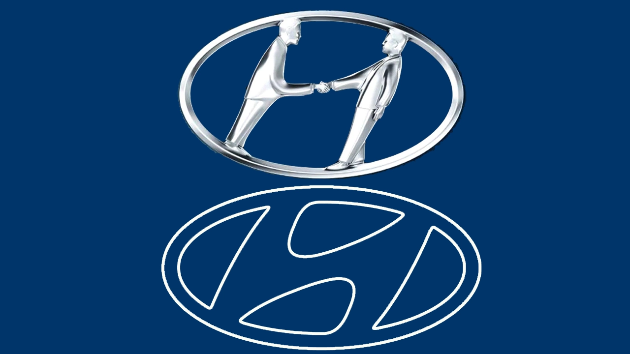
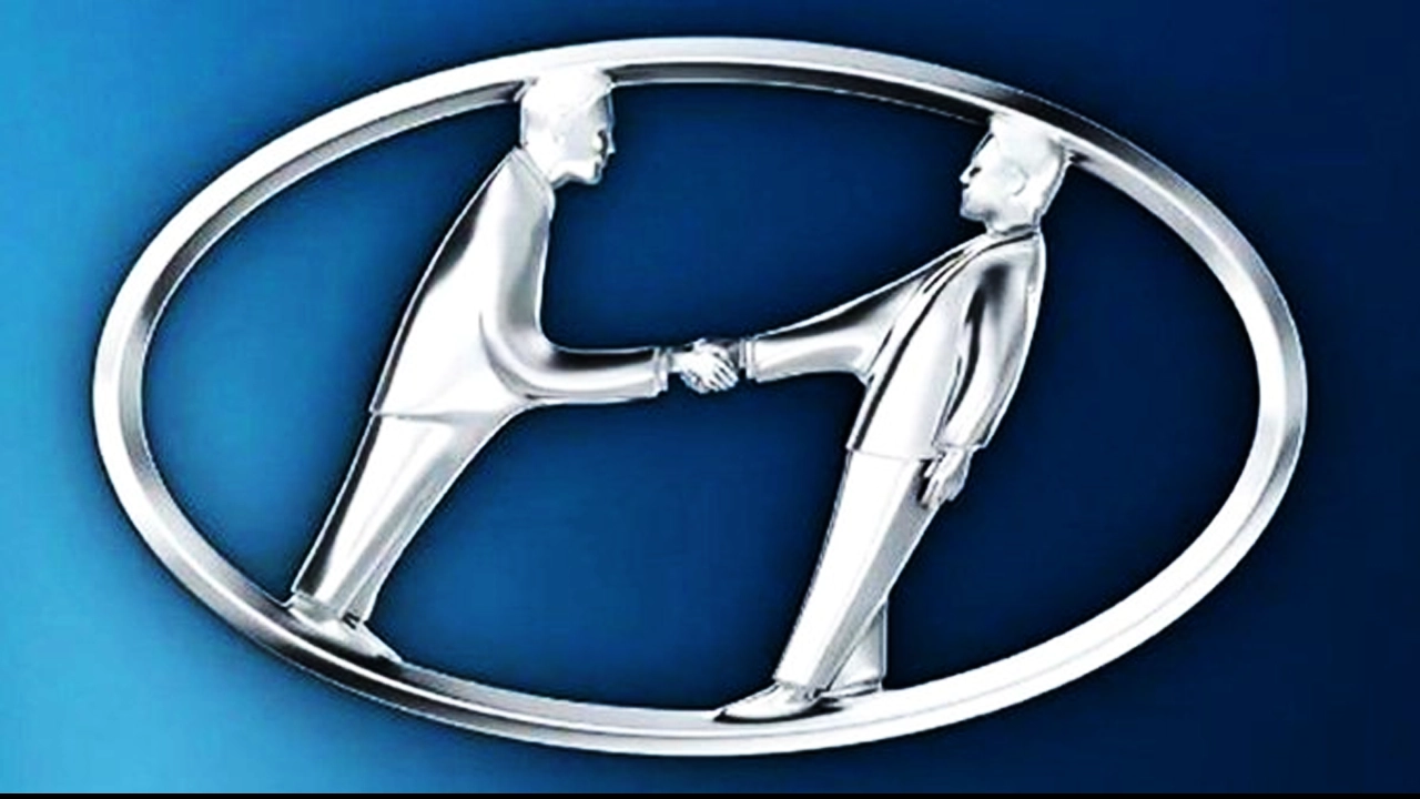
There are two meanings conveyed by the original Hyundai symbol. It serves as a straightforward “H” at first, signifying the Hyundai brand. But there’s also a silhouette of two people extending their hands. The business and the client in a cooperative arrangement are the two individuals symbolized by this silhouette. Stated differently, the Hyundai emblem embodies the company’s ideal aim, which is to offer all clients top-notch cars and services.

Font and Color:
Hyundai’s logotype is a futuristic, bold sans-serif typeface set in mixed case that resembles typefaces like Bank Sans SemiCond Bold and Lustra Semi Bold. One side of the letters’ angles is sharper than the other, giving them a distinct mood and a sense of motion and speed. Based on a deep shade of blue, the South Korean automaker’s color scheme is sleek and polished, signifying the company’s quality and confidence as well as its industry knowledge.
The story behind the Hyundai logo:
1969-1970:
The initial Hyundai logo was somewhat basic, consisting of the company name encircling a circle with the letters “H” and “D” in italics at the center. Hyundai was aiming for flare, yet this design lacked it. The rounded right side of the “D” and the elongated right leg of the “H,” which resembles a little spike, give the font its unique qualities.
1970-1974:
The circular component was altered in this version of the logo, but all other components were retained by the designers. They made the circle flatter so that it became an oval. The bracket inside the oval appeared significantly slanted towards the back as a result of this change in perspective.
1974-1978:
The logo was positioned within a thin black circular frame on top of a white backdrop. From 1974 to 1992, this logo was in use.The black-and-white monogram “HD” in an extra-bold bespoke typeface was the 1974 Hyundai Group logo. It was set on a rectangular background with sharpened bottom corners and rounded top corners. The upper portion of the elongated “H” was pointed and its right vertical bar was curved toward the right.
1978-1990:
Compared to the old logo, the new one is simpler and more modern. The letters “HD” are incorporated within a rectangular frame, with the letter “D” filled with a solid color. The insignia gains a sense of solidity and balance from the rectangular frame and the readable lettering.
1990-2003:
Hyundai debuted a new logo design in 1990 that was very different from earlier versions of the brand. The new logo has an oval-shaped, stylized letter “H” in place of the company name and the “HD” insignia. The logo design gained movement and vitality from the slightly slanted letter. The new logo nevertheless used the same color scheme, which was primarily white and dark blue.
2003-2011:
Hyundai made minor revisions to the logo design in 2003. For the logotype, the company used a sans-serif font, which gave it a contemporary, tidy, and elegant look. The corporation updated the logo’s appearance by selecting a different shade of blue. Moreover, the wordmark “Hyundai” was inserted to the left of the insignia, utilizing the identical blue hue as the symbol.
2011-NOW:
The visual identity of Hyundai underwent a notable transition with the release of the 2011 logo. The stylized letter “H” encased in an oval form served as the focal point of the symbol, which debuted a leaner and more modern design approach. The “H” was painstakingly designed to radiate a dynamic, three-dimensional appearance, giving the logo a sense of forward motion.
Hyundai Logo Today:
The Hyundai emblem of today has a straightforward yet appealing style. The picture has an oval border around a stylized, slanted “H.” The term “Hyundai” is typically printed in an angular, sans-serif font beneath the Hyundai emblem when it is used in marketing materials. The Hyundai logo is considered by many to be the most simplistic. Most people believe that the “H” of the Hyundai symbol corresponds to the “H” of the company’s name, much like the Honda emblem.
Conclusion:
The Hyundai logo is essentially a sophisticated and multidimensional design that embodies the company’s three main values: innovation, trust, and global reach. It’s a symbol that has effectively changed with the brand while still being impactful and readily identifiable. The Hyundai logo participated in making a significant logo in this way. Hyundai is currently one of the top auto brands worldwide, and its cars are renowned for being dependable and reasonably priced.
